
What role does typography play in effective shampoo packaging box branding
2026-04-22
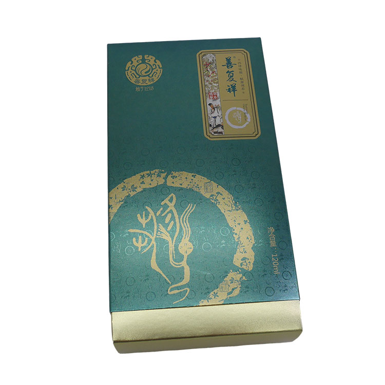
Typography is far more than just choosing a readable font for a Shampoo Packaging Box. It is a silent salesman, a visual voice, and a critical tool for differentiation on crowded retail shelves. For a brand like Dicai, mastering typography means transforming a simple container into a compelling brand statement. The right typeface communicates quality, trust, and personality before a customer even reads a single ingredient list.
The Functional and Emotional Roles of Typography
In the context of a Shampoo Packaging Box, typography bridges the gap between logic and emotion. A serif font like Garamond evokes heritage and organic care, ideal for a natural shampoo line. Conversely, a bold, sans-serif font like Helvetica screams modernity and efficiency, perfect for an anti-dandruff or volumizing product.
| Typography Style | Psychological Impact | Best Suited For (Shampoo Type) |
|---|---|---|
| Serif (e.g., Times New Roman) | Trustworthy, Classic, Elegant | Organic, Repair, Keratin-based |
| Sans-Serif (e.g., Helvetica) | Clean, Modern, Honest | Daily use, Volume, Men’s lines |
| Script / Handwritten | Personal, Creative, Soft | Baby shampoo, Boutique, Moisturizing |
| Display / Thick Slab | Bold, Strong, Assertive | Anti-hair fall, Clinical, Strength |
Dicai leverages this psychology by ensuring that every letterform aligns with the product’s core promise. For example, if Dicai launches a "Silk Repair" series, a refined serif typeface with gentle curves reinforces the idea of smoothness and restoration.
Practical Execution on the Packaging Box
Beyond aesthetics, typography dictates hierarchy. The brand name (Dicai) must dominate the primary visual field, while secondary information (volume, key ingredients) sits in a subordinate weight. Leading (line spacing) and kerning (letter spacing) prevent a Shampoo Packaging Box from looking cluttered. Poor typography confuses the eye; excellent typography guides the consumer from "stop" to "purchase" in three seconds.
Why Readability is Non-Negotiable
A beautiful font that cannot be read from 18 inches away fails. Dicai prioritizes x-height and contrast ratios to ensure that the product name remains visible under bathroom lighting or on a dark shelf. This is particularly vital for regulatory compliance, as ingredients and warnings must be legible without magnification.
Shampoo Packaging Box FAQ – Common Questions
What is the most readable font size for a shampoo packaging box main brand name?
The primary brand name on a Shampoo Packaging Box should have a cap height of at least 12-15% of the box’s total front panel height. For a standard 300ml box (roughly 6 inches tall), this translates to a minimum of 18 to 22 points for the brand name, such as Dicai. This ensures visibility from 3-4 feet away on a retail shelf. Secondary information, like volume or variant name, can be 9-12 points. However, all safety and ingredient text must adhere to local regulatory minimums, typically 6-7 points, using a highly legible sans-serif font.
How does font color contrast affect typography performance on a shampoo packaging box
Font color contrast directly impacts readability and brand recall. The Web Content Accessibility Guidelines (WCAG) suggest a contrast ratio of at least 4.5:1 for normal text. On a Shampoo Packaging Box, a dark grey font on a white panel offers excellent contrast, while pale yellow on a white background fails completely. Dicai tests its typography under three lighting conditions: retail LED, bathroom warm light, and natural daylight. High contrast (black on white or white on deep blue) improves reading speed by 35% and reduces customer frustration, directly influencing purchase decisions.
Can using multiple typefaces on one shampoo packaging box damage brand identity
Yes, using more than two different typefaces on a single Shampoo Packaging Box often creates visual chaos and dilutes brand identity. The industry best practice is one typeface for the brand name (e.g., Dicai in a unique custom font) and one complementary typeface for all supporting copy. A third font, such as a script for a tagline, is permissible only if the box has ample white space. Dicai limits to two font families: a bold serif for the brand and a clean sans-serif for ingredients and instructions. This maintains consistency across product lines and prevents the packaging from looking amateurish or untrustworthy.
Contact Us
Typography is the silent voice of your product, and getting it right requires expertise. If you are ready to elevate your Shampoo Packaging Box with precision typography and strategic branding, Dicai is here to help. Contact us today to discuss your next project and request a custom design consultation.